

Understanding paint undertones helps you choose colors that look cohesive and balanced in your space. By recognizing subtle hues like warm yellows or cool blues, you can match shades effectively and avoid clashes. Lighting plays a big role, making undertones seem different at various times of day. Paying attention to how colors appear in your specific lighting guarantees a polished, intentional look. Keep exploring, and you’ll discover more tips to master color harmony and coordination.
Key Takeaways
- Recognizing undertones involves identifying subtle hues like yellow, blue, or green that influence a paint color’s overall appearance.
- Observe paint samples in different lighting conditions to accurately perceive their true undertones.
- Matching undertones across walls, furniture, and decor creates cohesive and harmonious spaces.
- Comparing side-by-side swatches helps detect subtle differences in undertones before making a choice.
- Understanding how lighting affects color perception ensures selections look appealing both day and night.
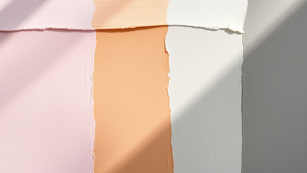
Have you ever wondered why two shades of the same color can look so different when you see them on your walls? It’s often because of undertones, subtle hues that influence how a color appears in various settings. Understanding paint undertones is key to achieving a cohesive and harmonious look in your space. When you’re selecting paint, you might notice that colors labeled as “white,” “gray,” or “blue” can have hints of other shades—warm or cool undertones—that change their overall feel. These undertones can be as subtle as a whisper or as pronounced as a bold accent, but they play a vital role in color matching and overall design.
Undertones subtly influence how colors appear, making awareness essential for cohesive, harmonious interior design.
Lighting effects are a major factor in how undertones are perceived. Natural sunlight can make warm undertones like yellow or peach seem more vibrant, while cooler undertones such as blue or green can appear subdued or even greyish. Conversely, in artificial lighting, especially warm incandescent bulbs, cool undertones can appear muted or shift towards warmer hues. This means that the same wall color can look entirely different at different times of day or under various lighting conditions. To get a true sense of a paint’s undertone, it’s essential to observe samples in the lighting conditions of your space—both daytime and evening. This way, you can avoid surprises once the paint dries and your lighting is set.
Color matching becomes more straightforward once you understand undertones. If you’re trying to coordinate multiple rooms or match furniture and decor, knowing the undertones helps you select shades that don’t clash. For example, if your sofa has cool undertones, choosing a wall color with similar cool undertones ensures a seamless, cohesive appearance. Conversely, mixing warm and cool shades intentionally can create contrast and visual interest, but it requires an understanding of how undertones interact with lighting. When you’re shopping for paint, look at color swatches in different lighting to see their true undertones. It’s also helpful to compare shades side-by-side, as this reveals subtle differences that might not be obvious in isolation.
Additionally, being aware of undertones can help you make better decisions when selecting outdoor paint colors or designing spaces with multiple textures and materials. Ultimately, appreciating the nuances of undertones allows you to make more informed decisions about color matching and lighting effects. By observing how different shades respond to your specific lighting setup, you guarantee your walls look exactly how you envision them—whether warm, cool, or somewhere in between. Recognizing these details helps you create a space that’s perfectly tailored to your style and lighting conditions, avoiding mismatched hues and achieving a polished, intentional look.
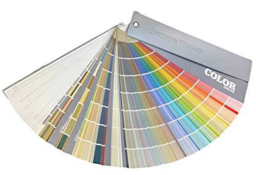
Sherwin Williams Colors collection Deck Complete Paint Colors
As an affiliate, we earn on qualifying purchases.
As an affiliate, we earn on qualifying purchases.
Frequently Asked Questions
How Do Lighting Conditions Affect Paint Undertone Appearance?
Lighting conditions considerably impact how paint undertones appear. Natural light can make warm undertones look more vibrant and cool undertones more subdued, while artificial lighting can change their hue entirely. You’ll notice colors shifting throughout the day as sunlight varies, and different bulbs can cast a yellow or bluish tint. To guarantee your paint looks great, test samples under both natural and artificial lighting before making a final decision.
Can Paint Undertones Change Over Time?
Paint undertones can subtly shift over time due to paint chemistry and environmental influences. You might notice a tone turning warmer, cooler, or duller, influenced by factors like light exposure, aging, or room conditions. These changes affect color psychology, impacting how a space feels. To keep your colors consistent, consider using high-quality paints and proper sealing. Regularly observe your paint’s personality, and you’ll master managing its mood and mood swings.
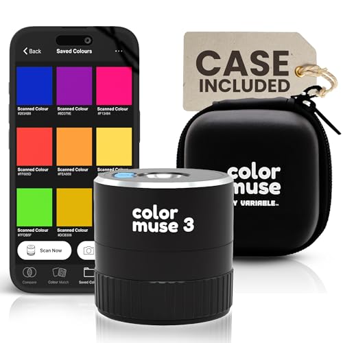
What Tools Help Identify the True Undertone of a Paint Color?
You can identify the true undertone of a paint color using tools like color swatch comparisons and digital color analyzers. With swatch comparison, you hold different shades against your wall to see subtle differences. Digital analyzers scan paint samples to reveal precise undertone information. These tools help you confidently choose the right hue, ensuring your color matches your vision and stays consistent over time.
How Do Undertones Influence the Overall Mood of a Room?
Undertones are like the heartbeat of a room’s color, subtly guiding its emotional impact. They shape the mood through color psychology, influencing how you feel in the space. Warm undertones create inviting, energetic vibes, while cool ones evoke calm and serenity. By choosing the right undertone, you craft a space that resonates emotionally, making every moment spent there feel just right.
Are There Specific Colors That Are More Likely to Have Tricky Undertones?
Certain colors, like grays, beiges, and whites, tend to have tricky undertones that can be hard to distinguish. You should do color swatch comparisons in your space, observing how natural and artificial light affect them. Use undertone identification tips, such as checking if a color looks warm or cool next to other hues, to ensure you pick the right shade. This helps prevent surprises once the paint dries.

20 Sheets Color Swatch Chart Fits 50 100 Colors Watercolor Paint Set Watercolor Swatch Cards Blank Color Chart Template 7.9×4 Inch Portable Paint Kit for Adult Beginners Professional Painting Lovers
Note:Our product only includes color swatch chart, not a palette. Thank you.
As an affiliate, we earn on qualifying purchases.
As an affiliate, we earn on qualifying purchases.
Conclusion
Now that you understand paint undertones, you’re better equipped to choose the perfect shade for your space. Remember, picking the right color isn’t always black and white—those subtle undertones can make all the difference. Don’t be afraid to trust your instincts and test samples before committing. With a little patience and an eye for detail, you’ll avoid painting yourself into a corner and create a room that truly feels like home.

Angchun Handheld Colorimeter – Precise Portable Color Analyzer Digital Color Reader with 8mm Aperture and True -Color Display Tester Kit Lab Colorimeter Color Difference Meter Tester for Multi-Purpose
✅【Multifunctional Colorimeter】Angchun portable color analyzer widely applies to color quality control, color difference control, color difference analysis, sampling…
As an affiliate, we earn on qualifying purchases.
As an affiliate, we earn on qualifying purchases.
COLOR MUSE 3 Portable Color Matching and Paint Scanner Device with Protective Travel Case – Wireless Digital Colorimeter Sensor for Accurate Color – Pocket-Sized, Easy Carry, Indoor/Outdoor Projects
COLOR & SHEEN MATCHING TECHNOLOGY: Color Muse 3 measures both color and sheen in one scan using a…
As an affiliate, we earn on qualifying purchases.
As an affiliate, we earn on qualifying purchases.